What is the Difference Between the Desktop Era and the Mobile Era?
mobile-first website, optimize for mobile, mobile era, desktop era

The transition from the Desktop Era to the Mobile Era has revolutionized the digital landscape, fundamentally altering how businesses and users interact with technology. In this article, we'll explore the key differences between these two eras and how they impact IT professionals, business owners, and novice website builders. We'll delve into various aspects such as user behavior, design considerations, link building, and website authority. While avoiding excessive technical jargon, we'll provide clear explanations and practical examples to ensure accessibility. Let's uncover the pivotal distinctions and actionable tips to succeed in the Mobile Era.
1: User Behavior in the Desktop Era vs. the Mobile Era
In the Desktop Era, users primarily accessed the internet through personal computers or laptops, often at home or in the office. This fixed environment allowed for larger screens and precise input methods (keyboard and mouse). As a result, users tended to spend more time on websites and explore multiple pages.
In contrast, the Mobile Era is characterized by users accessing the internet through smartphones and tablets while on the go. This shift has shortened attention spans, leading to a higher emphasis on quick, seamless interactions. Mobile users prefer instant access to information and engage in "snackable" content, making them more likely to skim through pages and spend less time on websites.
Practical Tip: Optimize your website for mobile responsiveness to cater to the needs of on-the-go users. Use concise and compelling headlines to capture their attention quickly and prioritize relevant content to improve engagement.
2: Design Considerations for Desktop and Mobile Experiences
Desktop websites traditionally offered more screen real estate, enabling designers to create intricate layouts and feature-rich interfaces. Such design freedom allowed for elaborate navigation menus and sidebars.
On the other hand, mobile websites require a different approach due to limited screen space. Designers must focus on simplicity, intuitive navigation, and touch-friendly elements. Mobile-First design has become essential to ensure seamless user experiences across devices.
Practical Tip: Implement responsive design techniques to adapt your website layout automatically based on the user's device. This approach guarantees that your content looks appealing and remains functional on both desktop and mobile screens.
3: Link Building and Website Authority in the Two Eras
During the Desktop Era, link building strategies often emphasized acquiring backlinks from high-authority websites. Search engines considered the number of backlinks as a significant ranking factor, leading to link-building practices that focused on quantity rather than quality.
In the Mobile Era, search engines have evolved to prioritize user experience and relevance. While backlinks remain crucial, the quality and relevance of links have gained more prominence. Building meaningful relationships and obtaining links from contextually relevant and authoritative sources yield better results.
Practical Tip: Focus on producing valuable and shareable content to attract organic backlinks from reputable websites. Engage with influencers and industry leaders to increase your chances of getting authoritative links.
4: Website Authority and Mobile SEO
In the Desktop Era, websites' authority was primarily assessed based on their performance on desktop devices. However, with the proliferation of mobile usage, search engines now consider mobile-friendliness as a crucial factor for website authority.
Mobile SEO focuses on optimizing website speed, mobile responsiveness, and providing a smooth user experience. Websites that perform well on mobile devices gain higher search rankings, improving their overall authority.
Practical Tip: Use Google's mobile-friendly test to check your website's mobile performance. Optimize images, minimize server response times, and enable browser caching to enhance mobile site speed.
5: Accelerated Mobile Pages (AMP)
To cater to mobile users' need for fast-loading pages, Google introduced Accelerated Mobile Pages (AMP). AMP is an open-source framework that enables web pages to load almost instantaneously on mobile devices.
By implementing AMP, website owners can significantly improve mobile user experiences, reduce bounce rates, and enhance their mobile SEO efforts.
Practical Tip: Consider implementing AMP for your content-heavy pages like blog posts and news articles to provide an optimal mobile experience, increasing the likelihood of retaining visitors and driving conversions.
Conclusion:
The transition from the Desktop Era to the Mobile Era has ushered in a new digital landscape, demanding a shift in strategies for IT professionals, business owners, and novice website builders. Understanding the differences in user behavior, design considerations, link building, website authority, and mobile SEO is vital for success in the Mobile Era.
By adapting your approach to accommodate mobile users' preferences, optimizing your website for mobile devices, and staying abreast of evolving mobile technologies like AMP, you can position your business for success in this mobile-first world. Embrace the opportunities presented by the Mobile Era to reach wider audiences and foster lasting connections with your users.
Heading
To add this web app to your homescreen, click on the "Share" icon
![]()
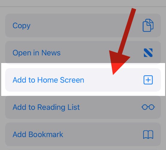
Then click on "Add to Home"

To add this web app to your homescreen, click on the "Share" icon
![]()
Then click on "Add to Home"

It looks like your browser doesn't natively support "Add To Homescreen", or you have disabled it (or maybe you have already added this web app to your applications?)
In any case, please check your browser options and information, thanks!
It looks like your browser doesn't natively support "Add To Homescreen", or you have disabled it (or maybe you have already added this web app to your applications?)
In any case, please check your browser options and information, thanks!
