
Staying Ahead of the Competition
Mobile-First Websites have become essential in today’s digital landscape. With the growing use of smartphones around the world, businesses are shifting their web development practices towards a mobile-first approach. This strategy emphasizes designing the website for smartphones and tablets first, then scaling it up for desktops and laptops. It ensures that websites look and function perfectly on all small screens first, which is very important given the majority of internet users are mobile users.
A mobile-first approach offers manifold benefits. Primarily, it improves user experience by enhancing the way sites function on small screens. Moreover, Google favours mobile-first websites, which means your site could potentially rank higher in search results. Such websites also load faster, thus reducing potential bounce rates. As mobile-first websites emphasize minimalistic design, they are less distracting, promoting better customer engagement.

Mobile-First Design for Better SEO
Staying competitive in today's digital age requires businesses to adapt to technological advancements. One of these advancements is the shift towards mobile-first websites. When your company adopts a mobile-first strategy, you ensure that your website serves the increasing mobile user demographic effectively. This not only increases your reach to a wider audience but also keeps you ahead of your competitors.
Google has been enforcing a mobile-first indexing policy since 2019. This means Google predominantly uses the mobile version of the content for indexing and ranking. Therefore, having a mobile-first website can greatly improve your SEO ranking, consequently driving more organic traffic to your website. By optimizing your site for mobile users, your business could potentially reap great benefits.

Faster Loading Speeds with Mobile-First Websites
Mobile-first websites are designed for optimal loading speed on mobile devices. Since the assets of these websites are optimized for smaller screens, they load faster than traditional desktop-first websites. Quick loading times can improve user experience, reduce bounce rates, and increase conversions, thereby enhancing overall business success.
Mobile-first websites significantly enhance user experiences. With their clean and simple design, users can easily navigate and interact with the website. Furthermore, mobile-first websites load swiftly, providing immediate access to information. This results in a streamlined experience that appeals to today's busy, on-the-go consumers.
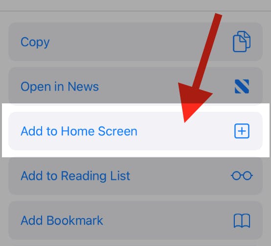
To add this web app to your homescreen, click on the "Share" icon

Then click on "Add to Home"
To add this web app to your homescreen, click on the "Share" icon
Then click on "Add to Home"
It looks like your browser doesn't natively support "Add To Homescreen", or you have disabled it (or maybe you have already added this web app to your applications?)
In any case, please check your browser options and information, thanks!
It looks like your browser doesn't natively support "Add To Homescreen", or you have disabled it (or maybe you have already added this web app to your applications?)
In any case, please check your browser options and information, thanks!
