Creating Your First Mobile-First Website?

In today's Mobile Era, having a strong online presence is essential for individuals and businesses alike. One of the best ways to establish your online presence is by creating a website. A website serves as a virtual storefront, providing a platform to showcase your products, services, or personal brand. When embarking on the journey of creating your first website, it's important to consider the modern trend of Mobile-First design. In this article, we will guide you through the process of building your first mobile-first website.
What is a Mobile-First website? As the name suggests, it's a website that is designed and optimized primarily for mobile devices, such as smartphones and tablets. With the increasing use of mobile devices to access the internet, it's crucial to ensure that your website provides an optimal user experience on smaller screens.
To create your first Mobile-First website, follow these steps:
1. Define your goals: Start by clarifying the purpose of your website. Are you selling products, offering services, or simply providing information? Understanding your goals will help you determine the layout, content, and features required for your website.
2. Plan your content: Outline the pages and sections you want on your website. Consider the information hierarchy and organize your content accordingly. Keep in mind that mobile users have limited screen space, so prioritize the most important information and keep the design clean and uncluttered.
3. Choosing MobilERA to build your website provides you with all the right tools to get the edge over other platforms. Our Mobile-First Platform features an easy to use intuitive dashboard and site builder, a range of helpful widgets and tutorial videos to make the website building process straightforward. Whether you build it from scratch or using one of our templates you can have your website live and online within a few hours.
4. Optimize for mobile: Pay attention to the speed and performance of your website. Mobile users expect fast loading times, so optimize your images, minimize code, and leverage caching techniques. Test your website on various mobile devices to ensure it functions flawlessly across platforms.
5. Prioritize user experience: Keep your website navigation simple and intuitive. Use clear headings, concise content, and prominent calls-to-action to guide users through your site. Ensure that buttons and links are large enough to be easily tapped on touchscreens.
6. Mobile-First features: Incorporate mobile-specific features to enhance the user experience. This can include click-to-call buttons, location-based services, and mobile-friendly forms. By providing these features, you make it easy for visitors to interact with your website on their mobile devices.
7. Test and optimize: Regularly test your website on different mobile devices and screen sizes. Identify any issues and make necessary adjustments to ensure a smooth experience. Keep an eye on analytics to understand user behavior and optimize your website accordingly.
Creating your first Mobile-First website may seem like a daunting task, but with the right approach, it becomes an achievable goal. By prioritizing mobile users and designing your website accordingly, you can reach a wider audience and provide an exceptional browsing experience. Embrace the mobile-first trend and take your first steps towards establishing a strong online presence today.
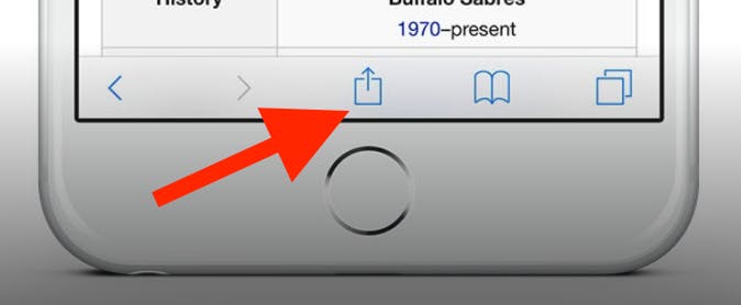
To add this web app to your homescreen, click on the "Share" icon
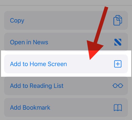
Then click on "Add to Home"
To add this web app to your homescreen, click on the "Share" icon
Then click on "Add to Home"
It looks like your browser doesn't natively support "Add To Homescreen", or you have disabled it (or maybe you have already added this web app to your applications?)
In any case, please check your browser options and information, thanks!
It looks like your browser doesn't natively support "Add To Homescreen", or you have disabled it (or maybe you have already added this web app to your applications?)
In any case, please check your browser options and information, thanks!
