
Why You Need a Mobile-First Website?
According to a recent UKOM report, a staggering 96% of people in the UK who used the Internet, accessed it from a Smartphone.
A Website built on the MobilERA Platform catapults your Business into the "Mobile Era" and allows your customers to browse your Services and Products directly from their Smartphones.

Progressive Web Apps Enhance Online Presence!
A Progressive Web App, or PWA, is a web application that combines the best of both worlds: the accessibility of a website and the functionality of a native app.
Discover how PWAs offer seamless user experiences, enhanced performance, improve SEO, and transform your online presence.

Increase User Engagement With Push Notifications!
In the ever-evolving digital landscape, Push Notifications have emerged as a pivotal tool for engaging audiences and driving user interaction.
Explore how Push Notifications can elevate your web presence and enhance user engagement, ultimately boosting your website authority and online success.

Our Easy To Use Platform!
Our Platform is easy to use and comes complete with instructional videos to help you create your Mobile-First Website, Progressive Web App or E-Commerce store.
Use one of our many templates to get started, or start from scratch. Either way, you can have your fully secure website or E-Commerce store up and running within a few hours.
Configure your Payment Processor (PayPal or Stripe) and add your products and contact information.

Our Easy To Use Widgets!
Our easy to use Widgets enable you to add the specific elements you want to your website. Once they have been added, you can drag them to change the order they appear on the website page and also reuse Widgets you have already configured on different pages.
You can set specific configurations for each Widget including if they are displayed only on Mobile/Desktop or both.


How Do I Get Started!
Click on the Button below to start building your Mobile-First website TODAY!
Once you sign up you can create your website and it is 'LIVE' on our Fully Secure SSL Certified Core URL.
During the Registration/Checkout Process you may be asked to Verify the Payment by your Bank using 3D Secure etc.
Once you have done this, you will be redirected to your Dashboard in the Website Building Platform.
If you have any issues during the Registration/Checkout Process please get in contact with us using the Contact Us Page.
All payments are made to MobilERA using Stripe and MobilERA will appear on your Bank Statement.
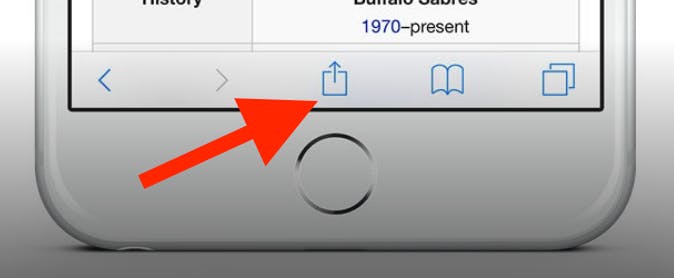
To add this web app to your homescreen, click on the "Share" icon
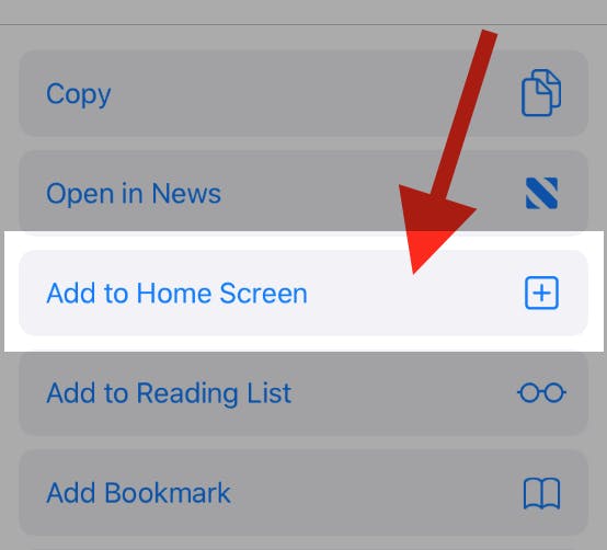
Then click on "Add to Home"
To add this web app to your homescreen, click on the "Share" icon
Then click on "Add to Home"
It looks like your browser doesn't natively support "Add To Homescreen", or you have disabled it (or maybe you have already added this web app to your applications?)
In any case, please check your browser options and information, thanks!
It looks like your browser doesn't natively support "Add To Homescreen", or you have disabled it (or maybe you have already added this web app to your applications?)
In any case, please check your browser options and information, thanks!
